MarketOmation Help & Support
-
Getting Started
-
Setting
- Account-Wide File Management
- Business Profile Creation Flow (Trust Center)
- Call Tracking and Missed Call Text Back for Google My Business
- Customizable 404 Error Page
- Email Validation
- GDPR Compliance Information
- How to Change the Currency Type
- How to Edit User Information and Permissions
- How To Include Email Signatures On All Outgoing Messages
- How To Reset Your Password
- How To Turn On/Off Alternate Timezones
- How to Use Audit Logs
- How To Use The Incorp Media LLC Dashboard
- How To Use The Universal Search Feature
- Incorp Media LLC Email Validation
- Internationalization: Multiple Language Support
- Internationalization: Multiple Language Support
- SendInBlue Setup
- Settings: Business Profile
- Settings: Company Billing Overview
- Settings: Custom Values
- Settings: Integrations
- Settings: My Staff
- Settings: Pipelines
- Settings: Reputation Management
- Settings: Tags
- Supported Media Types
- Template Library
- Show Remaining Articles (13) Collapse Articles
-
Conversations
-
Calendars
- Appointment Booking Process
- Calendar Color Codes
- Calendar Setup 101
- Calendar Sync Options
- Class Booking in Calendars
- Collective Booking - Calendars
- Google Meet Calendar Integration
- How to Add a Logo to Your Calendar
- How to Add Facebook Pixel to Survey, Forms & Calendars
- How To Block Off Time In A Calendar
- How to Copy or Duplicate a Calendar
- How to Create and Edit Calendars
- How to Deactivate and Activate Calendars
- How to Disable and Enable Calendar Services
- How to Integrate Your Outlook Calendar Using Calendar Bridge
- How to Override Calendar Availability
- How To Update Cancellation and Reschedule Links For Your Calendar
- How to Utilize the Calendar
- Outlook Calendar Integration
- Recurring Appointments
- Settings: Calendars
- Stripe Integration For Calendars
- What To Do If You Get The Google Calendar Writer Access Error
- Show Remaining Articles (8) Collapse Articles
-
Contacts
- Additional Emails per Contact
- Additional Phone Numbers per Contact
- Bulk Action Delivery Options
- Bulk Actions - Add or Remove Tags
- Bulk Actions - Deleting Contacts
- Bulk Actions - Email
- Bulk Actions - Import and Export Contacts
- Bulk Actions - Merge Duplicate Contacts
- Bulk Actions - Pipeline Change
- Bulk Actions - Sending Review Requests
- Bulk Import and Export of Multiple Emails for Contacts
- Bulk Import and Export of Multiple Phone Numbers for Contacts
- Business Fields
- Contact Company Overview
- Editing Pending and Processing Bulk Actions
- How The Sticky Contact Feature Works
- How To Add a Tag to New Contact List Import
- How to Allow or Prevent Duplicate Contacts
- How To Create and Edit Smart Lists
- How To Create and Use SMS And Email Templates
- How To Import and Export Contacts
- How to Navigate Contact Records
- How to Restore Deleted Contacts
- Managing Your Tasks Tab
- Using the Bulk Action Features
- Using the DND Feature
- Show Remaining Articles (11) Collapse Articles
-
Opportunities
-
Payments
- Affiliate Manager - Importing Contacts
- Affiliate Manager Overview
- Affiliate Manager Part 1 - How to Set Up your Affiliate Funnel with Products
- Affiliate Manager Part 2 - How to Add or Upload Affiliates
- Affiliate Manager: Media
- Apple Pay and Google Pay Invoices or Text2Pay Links
- Authorize.net Integration
- Automated Receipts for Invoices and Text2pay Link Payments
- Available Testing Cards for Payment Integrations
- Creating Recurring Invoices
- Customize Email and SMS Notifications for Invoicing
- Default Gateways for Payment Integrations
- Guide to Using Proposals and Estimates
- How to Create, Manage, and Void Invoices
- How To Customize The Tax Settings in Your Payments Section
- How To Download a PDF of an Invoice
- How to Process Refunds
- How to Test Payments in a Funnel or Website
- How To Use The Orders Tab in Your Payments Section
- How To Use The Payments Tab
- How To Use The Transactions Tab in Your Payments Section
- In Depth Look at Coupons
- Invoice Settings
- Network Merchants Inc. Integration
- Subscriptions Tab in Your Payments Section Overview
- Switching from FirstPromoter to Affiliate Manager
- Using Apple Pay and Google Pay in Order Forms
- Show Remaining Articles (12) Collapse Articles
-
Marketing
-
- "Add This Event To Your Calendar” Custom Values
- 2-way Email Sync for Outlook
- Best Practices To Prevent Your Emails from Ending up in Spam
- CC and BCC Features to Our Email Composer
- Checking Email Statistics
- Content AI in the Email Builder
- Custom Reply Address
- Email Analytics
- Email Attachment Size Limits
- Email Builder: Understanding Advance Conditions for Smart Lists and Tags
- Email Deliverability 101
- Email Statistics
- Email Templates vs Email Campaigns
- Forwarding Address and BCC in Email Setup
- Gmail 2-Way Email Sync
- How To Add the RSS Elements to Your Email Templates
- How to Change the Content of an Ongoing Email Campaign
- How to Connect SendGrid as your SMTP Service
- How to Create or Edit Your Email Signature
- How To Differentiate Between Basic and Custom for RSS Headers and Items in the Email Builder
- How to Find Hidden or Broken Elements in the Email Builder
- How To Hide Email Elements In The Mobile View Of Your Email Builder
- How to Import a Template to the Email Builder (Campaign)
- How to send a Regular Email Campaign
- How To Use RSS Feeds in the Email Builder
- How to Use the Design Editor for Email Templates
- How To Use the Email Builder
- How to Use the Email Builder and Its In-Line Editor
- How To Use Trigger Links in Emails
- Incorp Media LLC Email Authentication - DMARC
- Incorp Media LLC Email Unsubscribe Link
- Integrating Gmail for Email Service
- Introducing Email Errors
- List Unsubscribe Headers
- Masking Sender Emails - From Name and Address
- Masking the Sender's Name and Email Address in Incorp Media LLC Emails
- RSS Blocks In the Email Builder
- SMTP Error Code Tables
- Split Testing in Email Campaigns
- Test Email Error Troubleshooting
- Trigger Links in the Email Builder
- Using Custom Fonts in the Email Builder
- Using Mobile Formatting in the Email Builder
- Video Element in the Email Builder
- What To Do If Your RSS Email Body Is Showing HTML Tags
- Show Remaining Articles (30) Collapse Articles
-
- Bulk Scheduling Posts for the Social Planner Using a CSV
- Connecting Your Instagram Business Account to the Social Planner Social Media Tool
- Creating Posts in the Social Planner Social Media Tool
- Edit or Disable a Campaign
- Facebook Conversion API Integration for Lead Events
- Follow Up Comment
- How to Clear Linkedin Link Preview Cache
- How To Connect LinkedIn for the Social Planner
- How to Connect TikTok in the Social Planner
- How to Connect to Your Facebook Group for Use in the Social Planner
- How to Connect to Your Facebook Page for Use in the Social Planner
- How to Connect to Your Google My Business Page for Use in the Social Planner
- How to Connect Your Instagram Business Account With Your Facebook Account
- How To Connect Your Twitter Account for the Social Planner
- How to Create and Utilize the Group Hashtag Feature
- How To Create Groups of Social Media Accounts
- How To Post as a Page on Facebook Groups
- How to Schedule your Instagram Reel with the Social Planner
- How To Verify Your Domain With Facebook
- Instagram Direct Messaging Integration
- Instagram Direct Messaging Integration
- Launching a New Facebook Ad
- Managing Accounts
- Optimal Image and Video File Sizes and Dimensions for the Social Planner
- Post Approval in the Social Planner
- Publish Instagram Stories in the Social Planner
- Setting Up Email Notifications for Expired Social Media Accounts in the Social Planner
- Using the Social Planner Social Media Tool
- Viewing Failed Post Error Messages in the Social Planner
- What's a Follow Up Comment and How To Use it in the Social Planner
- Show Remaining Articles (15) Collapse Articles
-
-
Automation
-
- How And When To Use The Event Start Date In A Campaign
- How Does "Stop On Response" Work In A Campaign
- How To Build, Manage and Use Manual Actions in Campaigns
- How to Control Timing of Campaign Steps Using Delivery Windows
- How To Copy A Campaign
- How To Create A Basic Campaign
- How To Create An Appointment Confirmation And Appointment Reminders Campaign
- How to Create and Use the Google My Business Campaign Step
- How To Customize The From Email Address Configuration in Campaigns
- How To Enable or Disable the "Allow Multiple" feature in Campaigns
- How To Set Up Automated Calls And Voicemail Drops Within Your Campaigns
- How To Test A Campaign
- How To Use The Manual SMS Event in Campaigns
- How To Walk Through or Push Campaign Steps
- Pausing and Resuming a Campaign
- Viewing the Deliverability of Messages in Campaigns
- What Are Round Robin Campaigns And How To Use Them
- Show Remaining Articles (2) Collapse Articles
-
-
Reporting
-
Forms
- Background Images in Forms
- Create Surveys With the Template Library
- How To Add a Bump Offer in Order Forms
- How to Add or Remove Logos for Forms
- How To Build, Edit And Utilize Surveys
- How To Build, Edit, And Utilize Forms
- How to Export All Submissions from a Form or Survey
- How To Locate Survey and Form Answers
- How to Look Up Form Attribution
- How To Submit Mock Data for Forms and Surveys
- How To Use File Upload Custom Field in Forms and Surveys
- Pop-up Forms
- Signature Custom Field in Forms and Surveys
- Understanding Automatic Country Detection in Forms
- Understanding the Difference Between One-Step and Two-Step Order Forms
- Viewing Chat Widget Submissions
- Show Remaining Articles (1) Collapse Articles
-
Funnels and Websites
- Card Authorization for Subscription and Payment Plans
- Card Authorization in Websites
- Client Portal for Affiliates
- Cloudflare Setup
- Converting Funnel Steps and Website Pages Within Incorp Media LLC
- Funnel and Website Settings Overview
- How to Add A Facebook Pixel to a Funnel
- How to Add a Meta Tag for Google Search Console Domain Verification
- How to Add a One Time Product in the Funnel Builder
- How To Add a Privacy Policy and Cookies Pop Up
- How To Add A Subscription Product To Your Funnel
- How to Add Facebook Pixel to Your Website
- How To Clone and Share Funnels
- How to Connect Your Domain to a Funnel or Website
- How To Create A Custom Website
- How To Create and Add a Chat Widget to Funnels and Websites
- How To Import Your Funnels from ClickFunnels
- How To Redirect Domains (from www to non-www) - Google Domains
- How To Redirect Domains in Cloudflare (for non-www. and www.)
- How To Set Up Payment Plans In Funnels
- How To Set Up Your XML Sitemap
- How to Setup and Configure a New Domain or Subdomain
- How to Transfer a Domain to Cloudflare
- How To Upload and Utilize A Favicon
- Implementing Funnel Best Practices
- Split Testing in Funnels
- Understanding URL Paths
- Show Remaining Articles (12) Collapse Articles
-
Site Builder
- Adding the Review Widget to your Funnel or Website
- Cart Mode in One-Step and Two-Step Order Forms
- Content AI for the Site Builder
- Custom Elements in the Site Builder
- Custom Fonts in the Site Builder
- Customizing Funnel and Website Colors
- Customizing Your Funnel and Website for Mobile and Desktop Views
- Funnel and Funnel Builder Overview
- Hosted Video Element
- How To Activate The One-Click Purchase In Your Funnel Step
- How to Add An Order Form to a Funnel or Website
- How To Add Hyperlinks to Websites And Funnels
- How to Change a Logo in the Funnel or Website Builder
- How To Configure The Buttons on Your Website
- How To Create and Update Global Sections
- How to Create and Use a Coupon/Promo Code - One Step Form
- How to Create and Use a Coupon/Promo Code - Two Step Form
- How To Upload Images and Use the Media Library
- How To Use an Image Element in the Funnel Builder
- How To Use Forms, Surveys And Calendars In Funnels
- How to Use Forms, Surveys, and Calendars in Funnels
- How To Use Time Delay In The Funnel and Website Builder
- How to use URL Parameters on your Landing Page
- Image Optimization In the Site Builder
- Navigation and Search Element for Blogs
- Order Confirmation Element in the Site Builder
- Text Elements in the Site Builder
- Using a Video Element in the Funnel Builder
- Show Remaining Articles (13) Collapse Articles
-
Blogs
-
Integrations and Widget
- Google Analytics 4 Setup
- How to Import Products From Stripe
- How To Integrate A Stripe Account
- How to Integrate and Use Paypal
- How To Integrate Your Facebook Account
- How To Integrate Your Facebook Account
- How to Update Facebook Page Selection & Permissions
- Integrating with Google and Google Calendars
- Local Services Ad - Reserve with Google Integration
- Local Services Ads With Google
- Mapping Facebook Form Fields
- Quickbooks Integration
- Shopify Integration
- TikTok Integration
- Wordpress Plugin for Chat Widget
- Zoom Integration
- Show Remaining Articles (1) Collapse Articles
-
Lead Finder
-
Mailgun
-
Memberships
- Creating and Customizing The Membership App
- How To Add a Chat Widget to your Membership Section
- How To Add A Customer to Your Membership Area, Course or Offer
- How to Build and Edit an Offer in Memberships
- How To Create A Membership One-Click Upsell
- How to Create and Edit Categories in Memberships
- How to Create and Edit Posts in Memberships
- How To Customize Membership Settings
- How To Customize The Membership Welcome Email Using Membership Settings or Workflows
- How to Manually Grant Access to Memberships
- How To Setup Drip Content for Subcategories in Memberships
- How To Use Membership Themes
- Magic Links for Memberships
- Managing Comments In Your Membership Section
- Membership - Revenue Analytics
- Membership Anayltics
- Membership Assessments
- Membership Products and Offers Overview
- Membership Settings
- Membership Settings: Site Details
- Memberships Overview
- Resending Membership Credentials
- Statuses on Memberships
- Workflow Action: Membership Grant Offer
- Show Remaining Articles (9) Collapse Articles
-
Mobile App
-
Phone
- 3DS Incorp Media LLC Phone
- A2P 10DLC Campaign Vetting Changes
- Agent Reporting
- Call Tracking
- How Inbound Call Routing Works
- How To Buy a Toll Free Number
- How To Convert Voicemail Drop Files into MP3 or WAV
- How To Get an Outbound Phone Number
- How To Increase Message Deliverability
- How To Record Calls And Listen To Recordings
- How to Use SMS and Phone Number Validation
- How To Use Text 2 Pay
- How to Use the Dialer Feature for One-Time Outbound Calls
- Inbound Call Routing to the Mobile App
- Missed Call Text Back
- Options within the Dialer
- Phone Messaging Policy
- Phone Number Settings Explained
- Phone Number Settings Explained
- Setting Up a Voicemail Drop and Voicemail Drop FAQs
- SMS Attachment Size Limits
- Using the Voicemail Feature
- Whisper Message
- Show Remaining Articles (8) Collapse Articles
-
Reputation Management and Reviews
-
Triggers
- Email and Phone Number Mapping In Triggers
- How The Duration in Days Filter Works
- How To Build and Utilize Triggers
- How to Build, Edit and Use Task Related Triggers
- How To Connect Course and Funnel Checkout Using Triggers
- How to Create a Trigger for Notifications for New Chats in the Chat Widget
- How To Create An Auto Responder Using Triggers
- How to Duplicate Triggers
- How to Filter A Trigger By Product Type
- How To Mark Appointment Status as Invalid Using Triggers
- How To Set up a Campaign and Trigger for Abandoned Cart Follow Up
- How to Set Up Email/SMS Notification When An Action Occurs Using Triggers
- How To Set Up Triggers From Form Submissions
- How To Use A Trigger for a Review Request Campaign or Email
- How to Utilize Lead Values in Pipelines and Triggers
- Loop Lockouts
- Membership Triggers Overview
- What To Do If Your Send Email Trigger Action Is Not Firing
- Show Remaining Articles (3) Collapse Articles
-
Troubleshooting
- Failed Post Error in the Social Planner
- Google My Business Publishing Troubleshooting
- How to Check Your Instagram Profile Type
- How to Clear your Browser Cache
- How to Fix Your SMS Settings if You Failed to Send SMS
- How to Send a Test Email and SMS
- How To Troubleshoot When Your Call Event Is Not Working In A Campaign
- Lead Ad Debugging for Facebook
- Lead Ad Debugging for Facebook
- Loop Lockouts in Workflows
- Order Form Fingerprint is Missing Error
- Troubleshooting Audio Issues
- Troubleshooting Domains
- What To Do If A Page Won't Load
-
Twilio
-
Webhooks
-
Wordpress
-
Workflow
- Bulk Actions - Campaigns and Workflows
- Customizing Delivery Timeframes Within Workflows
- Customizing the From Email Address in Workflows
- Customizing Your Settings in Workflows
- How To Connect Course and Funnel Checkout Using Workflows
- How To Create An Appointment Confirmation And Appointment Reminders Campaign in Workflows
- How to Duplicate or Copy a Workflow
- How to Get Notified When a Lead Opens an Email
- How to Get Notified When a Lead Opens an Email
- How to Import Campaigns into Workflows
- How To Mark Appointment Status as Invalid Using a Workflow
- How To Move Actions in the Workflow Builder
- How To Set Up Automated Calls And Voicemail Drops in a Workflow
- List of Workflow Actions
- List of Workflow Triggers
- Marking Calls as Completed
- Membership Triggers Overview for the Workflow Builder
- Pausing and Resuming Workflows
- Race Conditions in Workflows (Unexpected Behavior)
- Understanding the Workflow History and Status Tabs
- Understanding the Workflow Settings Tab
- Using a Workflow and Smart List To Track Failed SMS Contacts
- Using the Conversion List for Google Ads with Triggers and Workflows
- Using the History Tab in Workflows
- Using the Testing Features in Workflows
- Workflow Action: Edit Conversation
- Workflow Action: Goal Event
- Workflow Contact Attribution Variables
- Workflow Recipes
- Show Remaining Articles (14) Collapse Articles
-
Workflow Actions
- Workflow Action: Add Contact Tag
- Workflow Action: Add Task
- Workflow Action: Add To Affiliate Campaign
- Workflow Action: Add to Affiliate Manager
- Workflow Action: Add To Notes
- Workflow Action: Add To Workflow
- Workflow Action: AI Appointment Booking Bot
- Workflow Action: Assign To User
- Workflow Action: Call
- Workflow Action: Create/Update Opportunity
- Workflow Action: Facebook - Add To Custom Audience
- Workflow Action: Facebook - Conversion API
- Workflow Action: Facebook - Remove From Custom Audience
- Workflow Action: GMB Messaging
- Workflow Action: Go To
- Workflow Action: If/Else
- Workflow Action: Instagram DM
- Workflow Action: Manual Call
- Workflow Action: Manual SMS
- Workflow Action: Math Operation
- Workflow Action: Membership Revoke Offer
- Workflow Action: Messenger
- Workflow Action: Remove Assigned User
- Workflow Action: Remove Contact Tag
- Workflow Action: Remove From Affiliate Campaign
- Workflow Action: Remove From All Workflows
- Workflow Action: Remove From Workflow
- Workflow Action: Remove Opportunity
- Workflow Action: Send Email
- Workflow Action: Send Internal Notification
- Workflow Action: Send Review Request
- Workflow Action: Send SMS
- Workflow Action: Send To Eliza Agent Platform
- Workflow Action: Set Contact DND
- Workflow Action: Set Event Start Date
- Workflow Action: Update Affiliate
- Workflow Action: Update Appointment Status
- Workflow Action: Update Contact Field
- Workflow Action: Update Custom Value
- Workflow Action: Voicemail
- Workflow Action: Wait
- Workflow Action: Webhook
- Workflow Actions: Add to Google Adwords
- Show Remaining Articles (28) Collapse Articles
-
Workflow Guides
-
Workflow Premium Triggers and Actions
- Premium Triggers and Actions - Google Sheets - Create Spreadsheet Row
- Premium Triggers and Actions - Google Sheets - Delete Specific Spreadsheet Row
- Premium Triggers and Actions - Google Sheets - Delete Spreadsheet Row using Lookup
- Premium Triggers and Actions - Google Sheets - Lookup Spreadsheet Row
- Premium Triggers and Actions - Google Sheets - Overview
- Premium Triggers and Actions - Google Sheets - Update Specific Spreadsheet Row
- Premium Triggers and Actions - Google Sheets - Update Spreadsheet Row using Lookup
- Premium Triggers and Actions - Inbound Webhook
- Premium Triggers and Actions - Number Formatter
- Premium Triggers and Actions - Slack - Send Direct Message to a User
-
Zapier
-
Workflow Trigger
- Workflow Tigger: Email Events
- Workflow Trigger: Affiliate Created
- Workflow Trigger: Appointment Status
- Workflow Trigger: Birthday Reminder
- Workflow Trigger: Call Status
- Workflow Trigger: Category Completed
- Workflow Trigger: Contact Changed
- Workflow Trigger: Contact Created
- Workflow Trigger: Contact DND
- Workflow Trigger: Contact Tag
- Workflow Trigger: Custom Date Reminder
- Workflow Trigger: Customer Replied
- Workflow Trigger: Facebook Lead Form Submitted
- Workflow Trigger: Invoice
- Workflow Trigger: Membership Category Started
- Workflow Trigger: Membership Lesson Completed
- Workflow Trigger: Membership Lesson Started
- Workflow Trigger: Membership New Signup
- Workflow Trigger: Membership Product Completed
- Workflow Trigger: Membership Product Started
- Workflow Trigger: Note Added
- Workflow Trigger: Note Changed
- Workflow Trigger: Offer Access Granted
- Workflow Trigger: Opportunity Status Changed
- Workflow Trigger: Order Form Submission
- Workflow Trigger: Order Submitted
- Workflow Trigger: Payment Received
- Workflow Trigger: Pipeline Stage Changed
- Workflow Trigger: Product Access Granted
- Workflow Trigger: Product Access Removed
- Workflow Trigger: Shopify Abandoned Checkout
- Workflow Trigger: Shopify Order Fulfilled
- Workflow Trigger: Shopify Order Placed
- Workflow Trigger: Stale Opportunities
- Workflow Trigger: Survey Submitted
- Workflow trigger: Task Added
- Workflow Trigger: Task Reminder
- Workflow Trigger: TikTok Form Submitted
- Workflow Trigger: Trigger Link Clicked
- Workflow Trigger: Twilio Validation Error
- Workflow Trigger: User Login (Membership Login)
- Workflow Trigger: Video Tracking
- Show Remaining Articles (27) Collapse Articles
-
AI Bot
-
Facebook Ad Launcher
-
Membership
-
Settings
- Add Custom Value
- Audit Log / Real-Time Event Communication
- Business Profile
- Connecting Facebook & Instagram
- Conversation AI
- Custom Values
- Facebook Form Fields Mapping
- How To Add A Custom Field
- How To Use Custom Values
- Map Facebook Fields
- Microsoft Outlook
- Setting Up Root Domains
- Setting Up Shopify Integration
- Setting Up Sub-Domains
- Settings: Integrations
- Settings: Phone Numbers
- Settings: Pipelines
- Settings: Profile
- Settings: Team Management
- Stripe Integration
- Tags
- TikTok Ads Account Integration
- URL Redirects Overview
- User Notifications
- What Are Custom Fields?
- Zoom Integration
- Show Remaining Articles (12) Collapse Articles
How To Add A Custom Field
Make your data stand out with custom fields! With our platform, you can easily design surveys and forms that meet any unique objective in mind. Make surveys and forms tailored to your exact specifications. Create custom fields quickly and painlessly.
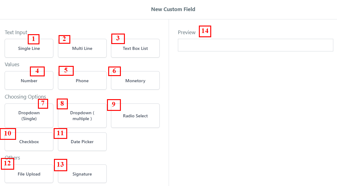
Custom Field Options
When generating new custom fields, a diverse range of options is available to you. These include:
- Single Line Text
Commonly referred to as “single-line text,” this particular text field is designed for instances when the user is required to provide a brief textual response.
- Multi Line Text Field
Often called “paragraph text,” this type of text field is employed when soliciting a more extensive textual response from the user. It allows for the submission of more comprehensive and detailed answers, accommodating larger amounts of text.
- Text Box List The text box list field gives your user a list of inputs that need to be filled. This is very useful when asking for text items closely related to keeping them all in one spot.
- Number Field
This is an input field that MUST contain numbers ONLY. This field can contain decimal points if needed as well.
- Phone Field
The phone field is used to capture phone numbers. There is also a country code selector so the user can select what country their phone number is registered in.
- Monetary Field
Like the numerical field, this field can only contain numbers as this is meant to capture monetary amounts.
This can be used when referencing things like salaries, gross income, hourly wages, etc.
- Single Options Dropdown Field
This is also known as a “drop-down field”. This allows the user to open a list of options to select from. They can only choose one option.
- Multiple Options Dropdown Field
Like the “single options” field, this field opens up a drop-down selector.
However, your user will be able to select multiple options with this field type.
- Radio Select Field
Radio buttons will give your user the ability to select their choice from a list of options.
Unlike the checkbox field, radio buttons restrict the user to only selecting one choice.
- Checkbox Field
This is your standard checkbox field. Users will be allowed to select multiple options when using the checkbox option.
- Date Picker Field
When clicked, the date field will open up a calendar that allows the user to select a specific date.
- File Upload Field
You can offer your user a file upload field where they can upload many different file types. You can also add an upload limit so the user does not upload too many files.
Supported file types are: PDF, DOC/DOCX, JPG/JPEG, PNG, GIF, CSV/XLSX
- Signature Field
Using this field you can collect a signature from your user. They will need to draw their signature with their computer mouse or touchpad.
- Preview
Depending on the chosen field type, a preview will be displayed on the right side of the popup, allowing you to visualize the appearance and functionality of the selected field.
Creating New Custom Fields
In this guide, we will walk you through the process of creating a new custom field, using the “Single Line” custom field as an example. This step-by-step approach will ensure a smooth and efficient setup for incorporating custom fields tailored to your specific needs.
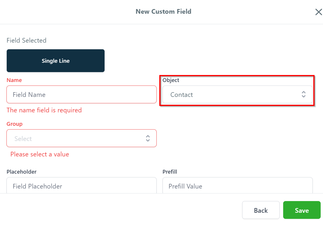
Field Selected
In this section, the chosen custom field type is displayed. For our current example, we are creating a “Single Line” custom field, which allows users to input brief text in a simple and efficient manner.
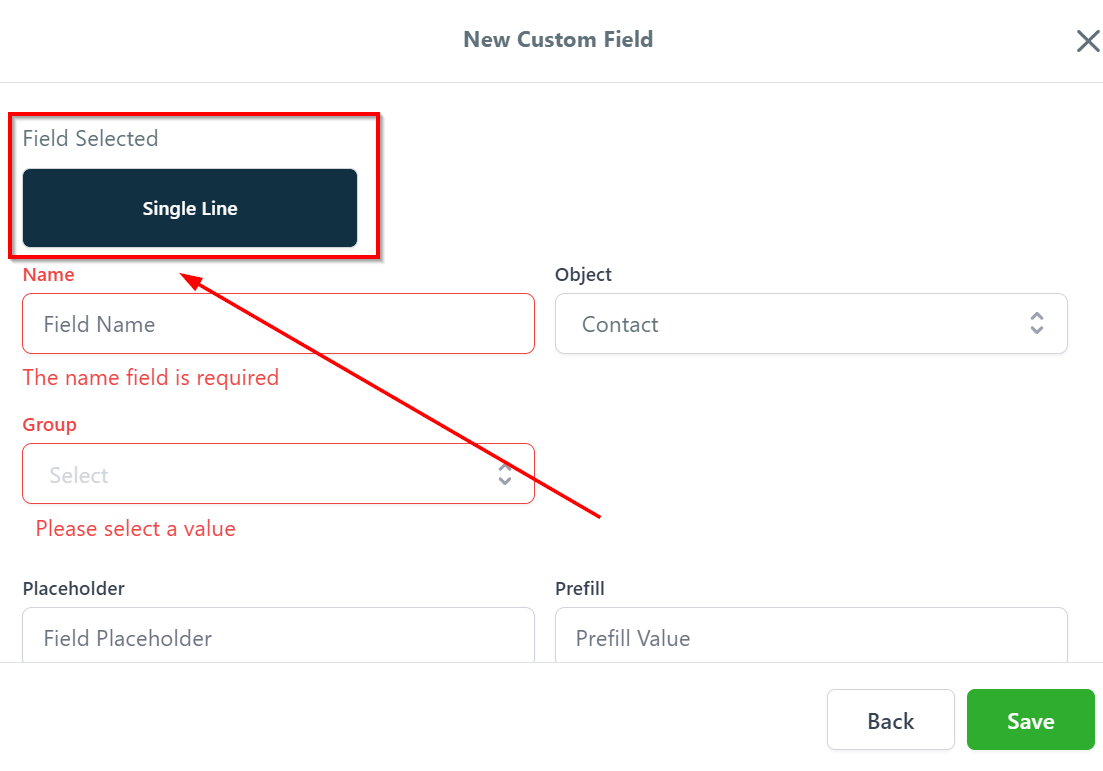
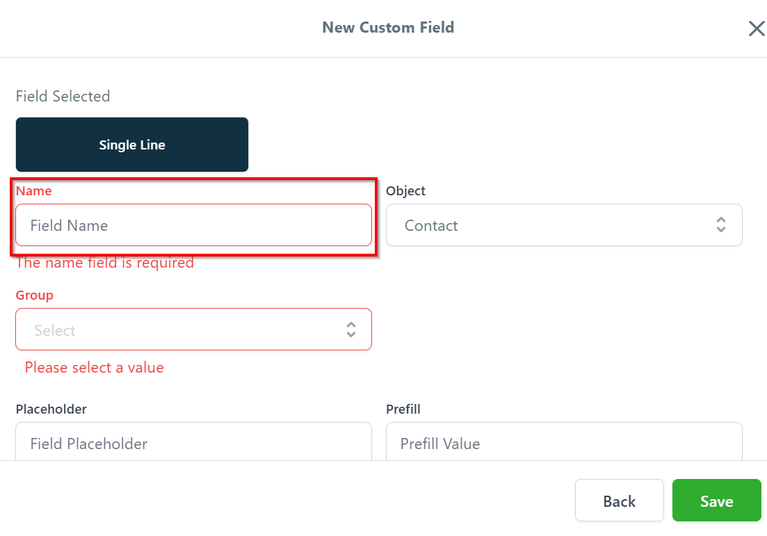
Name
Feel free to assign a suitable name to your field that aligns with your intended purpose.
Object
Utilizing the dropdown menu, you can easily choose the desired object associated with this particular tab.
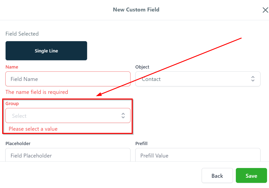
Group
In this section, you can determine the appropriate group to which the custom field should be added. The dropdown menu offers options to add the custom field to a contact group, general group, or any other specific group that you have created for this particular custom field.
Placeholder
In this area, you have the option to provide a placeholder for your custom field. A placeholder is a brief hint or example that guides users on the expected input format or content.

Prefill
You can also set a prefill value for your custom field, which serves as a default input that is automatically populated when users interact with the field. This feature can save time and effort for users, especially when the majority of entries share a common value or format.

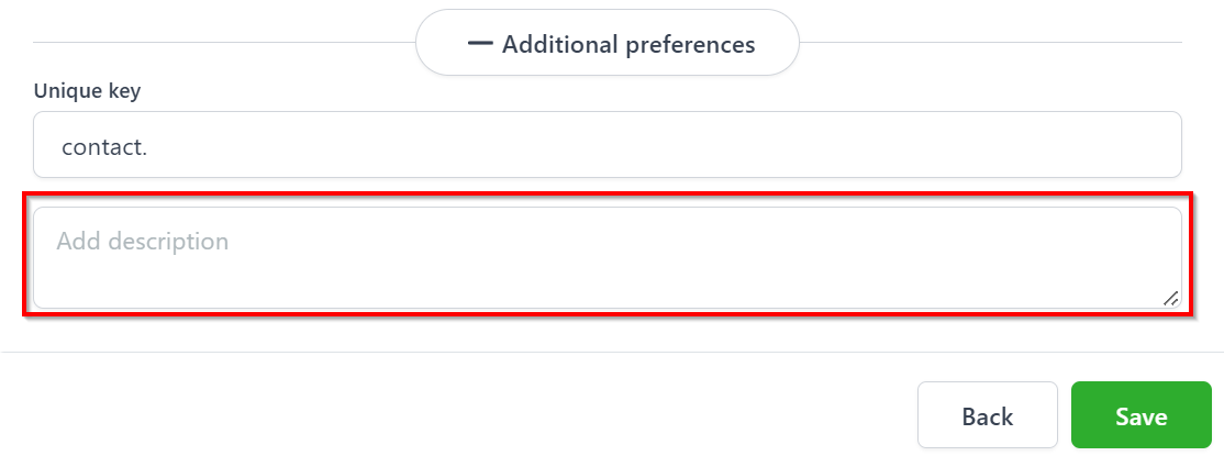
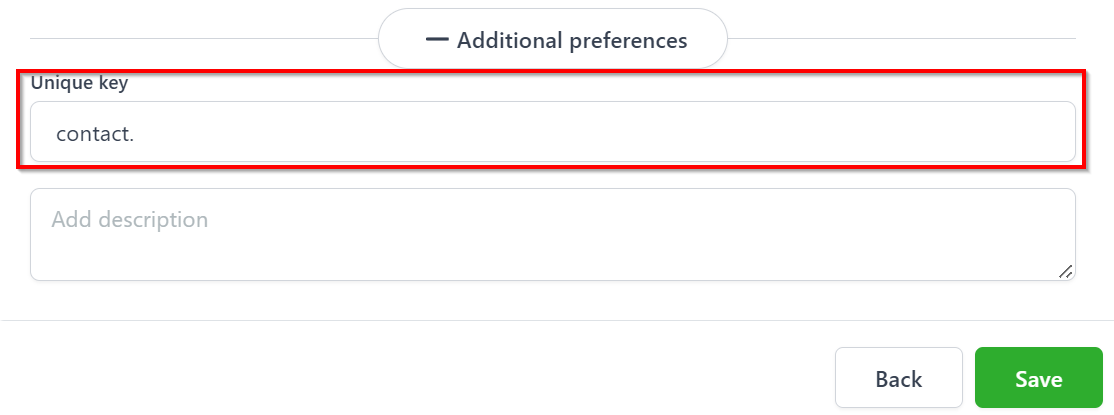
Additional Preferences
This tab will provide a few additional preferences with respect to your custom field.
Unique Key
Upon entering the custom field information into the system, a unique identifier key will be automatically generated for each custom field. This key will be displayed in this section and serves as a distinct reference for each field.
Add Description
In this section, you have the opportunity to provide additional details about your custom field. You can describe its purpose and the specific objectives it aims to achieve within your platform.